The gaps between these just keep getting longer, but here we go! The next milestone was achieved, and with that we’re finally on version 0.0.6. Another boring incremental update.
Nah, just kidding.
Playnote 0.1 is out!
This point marks the end of the first phase of development: all the foundational, “engine” work is largely done, and focus will now shift to game features and user experience.
The game currently looks like this:
This is the first formal release on the repository, and you can find it – together with Windows and Linux binaries – here.
On to the changes, then, from the nice-to-haves to the big new thing. There’s a lot, so strap in.
Warning-free build
On latest GCC, and with a large number of optional warnings enabled, the game builds even with -Werror enabled. (-Werror itself is enabled via an optional flag, so as not to unexpectedly break CI or contributors’ builds.) This took marking library includes as SYSTEM, a couple suppressions where the compiler’s analysis is a bit overzealous, and of course some genuine fixes to the code. To clean up the output further, most build-time tools are configured to produce no output if they’re successful.
The Windows build, though, is still full of spurious warnings. Frankly I have no idea where they’re coming from, since if they were correct the build should fail immediately. I choose not to dwell on it, as long as it works in the end.
XDG Base Directory Specification compliance
Big difficult words, but essentially it means that on Linux the runtime files are created in standard locations:
~/.config/playnotefor settings,~/.local/share/playnotefor persistent storage (currently the song library),~/.local/state/playnotefor the logs.
To restore the old behavior, also known as “portable mode”, create an empty file called Playnote.home next to the executable.
Windows currently has portable mode only. Support for locations such as %APPDATA% will be added later, alongside an installer.
AppImage packaging
Another treat for Linux users – The CMake install step now packages the game into an AppImage. This bundles the binary and runtime resources into a single executable file that works anywhere, which is about as convenient as it is possible to make it to run a Linux application short of publishing it on Steam. As a nice bonus it provides some compression, which reduces the download size from 95MB to 46MB – that’s over 2x smaller!
An AppImage is expected to also include all shared libraries that are needed to run, but might not be present on every computer. In the case of Playnote, however, there aren’t any – almost every dependency is linked statically. The only exception is libpipewire, because bad things happen if the client library’s version doesn’t match the version of the daemon running on the machine. Thankfully this shared library should be present on any computer that is running PipeWire, which has always been a requirement of Playnote to begin with.
Live window resize
Exactly what it sounds like, you can resize the game window. A minor convenience; in practice it means you can maximize the window without a restart, or switch in/out of fullscreen once that’s added. (Borderless, of course.) You can see it in action in the video above.
Now for some technical talk. This is, strictly speaking, not smooth resize. You will find it pretty choppy on Windows, or on Linux running X.org rather than Wayland. This is because the GPU is completely flushed before recreating the window surface, as a trivial way to prevent crashes and corruption. Resizing the “proper” way is a deceptively difficult undertaking, and is infamous for having consumed weeks of life of promising graphics programmers. Playnote’s separation of input and render threads would make it even more difficult. It’s just not worth it.
Text hinting
As an extra improvement to the sharpness of MSDF text, certain metrics are now snapped to whole pixels:
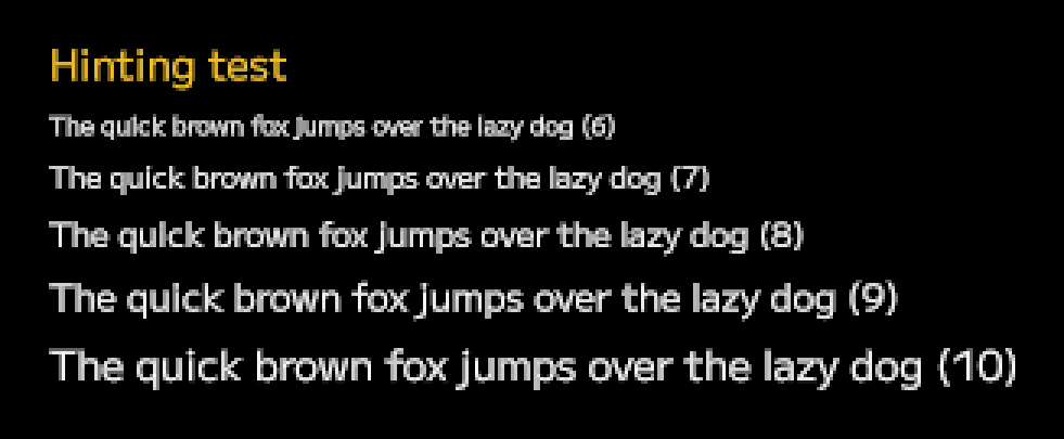
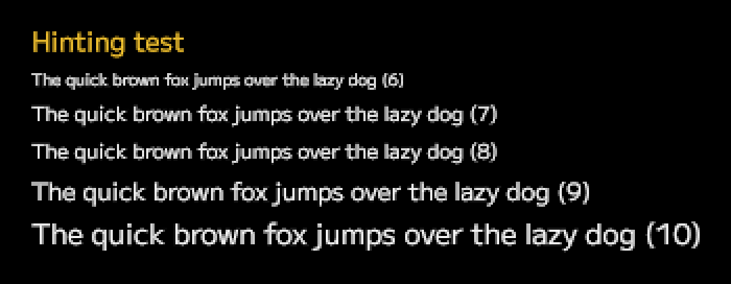
I’m cheating a little here; it’s not “real” hinting, at least in the way that OS-rendered text works. The algorithm first aligns the vertical position of each line so that the baseline lies on a border between pixels, and then tweaks the text size to the nearest value where the x-height is a whole number of pixels. (See this article for a primer on these metrics.)
This has an effect of improving average sharpness of horizontally oriented lines, especially of lowercase glyphs. This often comes at the expense of vertical lines, but those are separately improved with subpixel rendering, so frequency of detail is overall more balanced across X and Y axes.
Digital turntable support
A modern IIDX controller has its turntable exposed as an analogue axis, with the value indicating the current angle of spin. This is the ideal scenario, allowing for the most precise control in areas of the UI such as the song wheel. Older controllers though, most famously the Konami official controller for the PS2 releases, instead processed the analogue signal on the device itself, providing to the game a pair of buttons that indicated “spinning clockwise” and “spinning counterclockwise”. This was a binary signal – either spinning or not, the speed of the spin was lost. On the other hand, it made it trivial to implement scratch notes; the game could simply check if any of the two buttons was just pressed, without worrying about details like signal jitter or stopping distance.
The bottom line is, both exist out there, and so both need to work. And then there are keyboard users; a keyboard is naturally equivalent to a digital turntable. Early experiments with emulating an analogue signal with digital input were promising, but ultimately this never felt as snappy as it should. A user pressing the down arrow expects to switch to the next menu entry immediately, not after 0.2s of holding the key so that the emulated turntable spins enough to highlight the next item. Cleaning the analogue signal posed another challenge. The previous version already converted it into a stream of clockwise / counterclockwise input events, but UI elements want the raw signal to benefit from the variable speed.
In the end, there was no silver bullet. Raw inputs are split into two streams, for the UI interpreter and the gameplay interpreter respectively, and the UI interpreter passes both a relative angle change and an instantaneous tick as separate events that each UI element needs to handle via separate codepaths. It’s a lot of bother, but there was no better way for the game to feel snappy and responsive with every input device.
Chart start-up delay
This is a solution for two problems at once:
- Some charts are naughty and put their notes way too early,
- Playnote is too fast and gives you no time to prepare.
Both of them result in the same behavior – you choose your song, press “Start”, and the first note scrolls by before you had time to get your hands on the gameplay keys!
This is solved by starting charts from a negative timestamp, rather than zero, to ensure the larger of these two requirements are met:
- At least 2 seconds between gameplay start and the first note,
- At least 1 second between chart load and the first note.
The negative part of a chart timeline is empty and doesn’t trigger any sounds, so it functions as a delay. However, you can still mash keys to play samples during it if you’re bored.
The first of these delays includes the time the chart takes to load. Therefore, as long as the load was 1 second or less, you can start playing after the same amount of time regardless. This effectively hides the loading entirely.
The second delay ensures that the player is never blindsided by notes that have to be hit nearly immediately. Without it, in the case that there was a note at the start of the first measure (timestamp zero) and loading took 1900ms, the player would have only 100ms to hit the note from the moment of seeing it – faster than human reaction time! So, in the case that there is a note less than 1 second into the chart and the loading is longer than 1 second, the chart will be delayed further to ensure the player has time to actually see the note rather than it appearing already halfway down the playfield.
Switch from GLFW to SDL3
This sounds like a rather major undertaking, but was actually a pretty smooth transition. Windowing was already abstracted from the API, so it didn’t take much more than switching out some underlying calls.
Note that there is nothing wrong with GLFW! It’s an incredible library that I’ve used for a very long time for a number of projects. The dealbreaker was that it had no support for a certain feature which SDL3 supports very comprehensively. That feature is…
IME input support
Standing for Input Method Editor, this allows for text input in languages that have more characters than you can reasonably fit on a keyboard – Japanese, for example. IMEs might sound exotic for someone who used only Latin script their entire life, but they are the bread and butter of daily computer usage in other cultures. Considering where BMS is most popular, it would be outright impolite not to do this properly.
So – Playnote can now have text fields with full IME support, on Windows and Linux, including the partially composed (underlined) text:
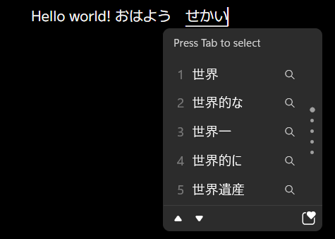
In addition to that, basic text editing is supported: arrow keys, backspace, delete, Ctrl+arrow for per-word seeking, Ctrl+backspace (Ctrl+W, if you live in a command line) to delete word. No selection yet, though.
There are no text fields in the game at the moment, but this will be useful for searching the song library in the future, or textual settings like difficulty table URLs.
Now we arrive at the elephant in the room, and what ate up all this development time.
The layout engine!
There are two modes of interacting with a rhythm game – gameplay, and menuing. In fact, a lot of it is menuing, so it’s important to make some damn solid menus. To make the game look great on any screen size, there was no other way around it – the screen contents need to dynamically adjust and reflow based on contents and available space. What started as a “hopefully minimal” layout system quickly evolved into one competent enough to be a project of its own.
Rather than describe all the steps and missteps of the development process, let’s have an overview of the end result. This might be pretty dry and boring, since it doesn’t have much to do with, you know, hitting notes to the beat. Still, I know enough UI programmers who might find my design choices interesting. If you’re not into this stuff, skip to the end. There’s a surprise waiting there. The last item will shock you. Clickbait tactics!
Coordinate system
The stable coordinates described in the previous post received an overhaul. The aspect ratio is still constant, but the extent can differ, and indicates available physical space for the content to fill. The extent is affected by two variables:
- As the physical window size increases, the coordinate space grows,
- As the DPI increases, the coordinate space shrinks.
This combined system gives DPI awareness for free, without having to pass a DPI or scale parameter into every renderable. Text is always the same physical size, maintaining readability while maximizing screen estate. An extra content_scale setting in the config can multiply the DPI as reported by the OS to further customize the look.
Widget hierarchy
Every element of the game is a widget:
Widgets can be nested. This ties them in a parent-child relationship; moving, rotating, scaling (etc.) the parent does the same to all its children, treating them a single unit. It is a retained-mode UI. There is one “root” widget, and it forms the trunk of a tree containing everything that is visible. Some universal actions are common to every widget: setting an inset (padding), enabling overflow clipping, setting size constraints, etc. They can also be permanently removed, temporarily disabled, or made invisible.
The only alignment (center, right-align, etc.) that can be done is of the widget contents within the widget bounds. This means the widget must be larger than its intrinsic content, for example by an explicit desired size parameter, or by expanding to fill all area made available by the parent.
There is no direct access to the list of a widget’s children. However, often a reference to a widget needs to be kept so that later it can be modified. To ensure these references are safe to use, every widget is managed by a shared_ptr, and the reference is a weak_ptr created from it. A widget can’t be accessed directly from a weak_ptr; it needs to be promoted to a shared_ptr first, and that promotion can safely fail if the underlying widget was destroyed. It’s a reference that knows when it’s stale.
Multi-pass layout
Widget state is retained, but layout happens constantly; there is no damage region tracking or dirty flag system. It consists of a series of passes that are executed in the same order every frame. A pass is a function called on the root widget, which recurses into all active children to traverse the entire tree. The passes are:
- Measure – update the widget’s intrinsic dimensions. This is the size that the widget “wants” to be, and would be if it was unconstrained by its parents.
- Arrange – here each widget gets positioned on the screen. The layout properties cascade, and transforms are multiplied together.
- Draw – the contents of the widget are queued up for drawing. The transform accumulated in the previous phase is applied, so each widget gets to pretend that its top-left is
(0, 0), and disregard scale or rotation. Parent draws before children, so children are drawn on top unless enforced otherwise with a depth value. - Sweep – here, expired widgets (marked for deletion) are actually freed. Delaying this until the end of the frame allows a widget to expire itself.
Decorators
A widget can have any number of decorators attached. They are one of two ways for a widget to actually queue up some shapes to draw. A decorator can draw something relative to the widget area; in fact, the only information a decorator gets about its widget are its dimensions. That makes them suitable for decorative elements like fills, borders, badges.
Which dimensions are passed depends on the sizing policy. This can be one of: inner (area available to widget content), padded (inner + inset area), outer (area made available by the parent). The policy is separate for width and height.
Layout widgets
The common ways in which a widget works are implemented on the Widget class, and can’t be overridden. However, a few customization points are made available – virtual methods that do nothing remarkable by default, but can be extended by subclasses to change certain parts of the process. (This is the Non-Virtual Interface pattern.)
A subclass that customizes the “arrange” pass is, by convention, a “layout widget”. A layout widget doesn’t draw anything by itself, but decides where its children go, changing the default behavior of stacking them at parent’s origin.
These layout widgets are currently available:
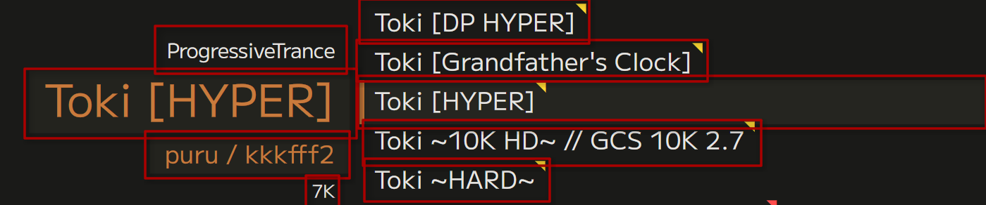
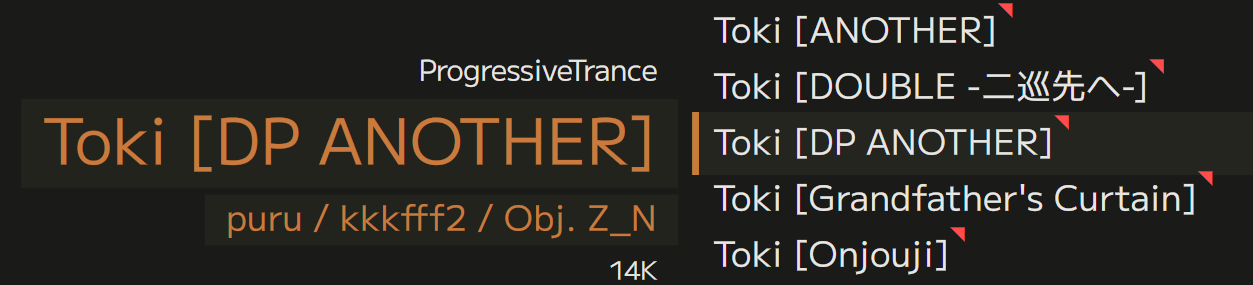
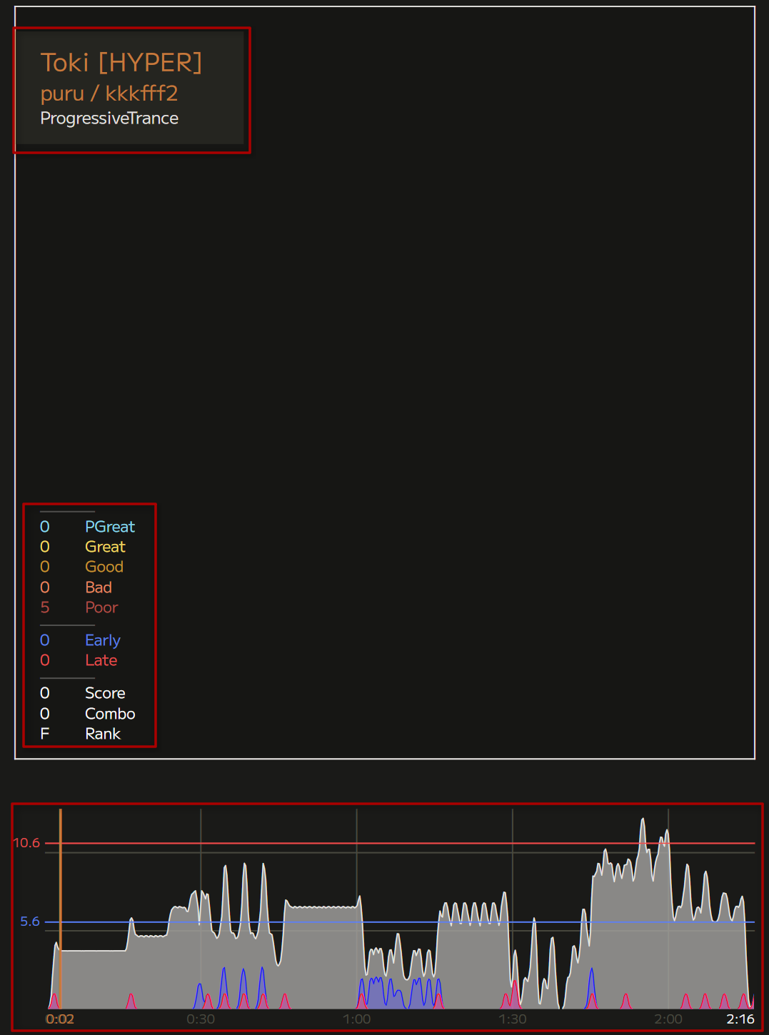
- Horizontal / vertical list: staggers its children alongside an axis. A major workhorse of layout. The chart info, above, is a vertical list.
- Horizontal / vertical scrolling list: as above, but designates a “selected” element that stays in place, while the rest of the list moves around. The selection area can have its own decorators. The song wheel is a vertical scrolling list.
- Column grid: Splits the available horizontal area into proportional chunks, and each child spans the next available chunk (or several). The library screen uses a column grid – it’s 5 columns wide, the chart info takes up 3 of them, and song wheel takes up the remaining 2.
- Modular grid: Same as a column grid, but in both axes. The gameplay screen is built on a modular grid.
To help customize layouts, every widget can have arbitrary LayoutParams data attached. This can for example set a custom margin before an element in a list, or specify the number of columns it takes up.
Leaf widgets
The second way for a widget to draw something is to have a subclass that customizes the “draw” pass. Widgets that do this are “leaf widgets”, since they generally don’t have children themselves.
Leaf widgets are typically bespoke, but there are a few more generic building-block ones available:
- Text: Simply a block of text. Deceptively complex – it can wrap or have newlines, and each line has to obey alignment individually. Present absolutely everywhere.
- Text input: A text field that can be modified with keyboard input. Currently unused.
- Knob: A cool, visual way to let the user choose a number or an entry from a list. Currently unused.
Animation
The power of a layout engine isn’t in making pretty pictures, but adapting to anything you give it. There’s no better way of leveraging that than animating widget properties.
Every public floating-point property can hold a constant value, or an animation. An animation is a list of keyframes on a timeline, with an easing function in-between each pair of keyframes, optionally looping. It is a closed-form upfront description of what will happen to the value over time, naturally framerate-independent.
To make it easy to create pleasant, dynamic UIs, every widget has an animation watcher. You can register an animation with it, together with a piece of code to run once that animation is over. A common usecase is sliding a widget offscreen and expiring it once it’s out; this is used around the place.
Focus manager
In mouse-and-keyboard UIs focus is secondary, since the user can click on anything they can see to interact with it. In a controller-based game, though, focus is all there is. It is necessarily a highly modal UI, full of lists and panels.
The current widget in focus is managed externally by the dispatcher. As the name suggests, it also sends input events to the right place in the tree. The widget can respond in a number of ways:
- Don’t contact the dispatcher from the handler at all. This silently indicates the event was processed and consumed.
- Call for a focus switch. Dispatcher changes the widget in focus. If that widget has a designated “focused widget”, go there instead. This helps skip multiple levels of the tree in one action.
- Call for a return. This is a focus switch in the other direction; it traverses into parents until there is one without a focused widget set. If it reaches a widget without a parent (the root), it silently fails.
- Push/pop. The dispatcher actually keeps a focus stack. Pushing onto it changes the focus, but allows it to be restored to the same place later. This is useful for overlays, like the pause menu.
- Bubble the event to the parent. This allows a widget that is not currently in focus to receive an input event. Some events are bubbled by default if not consumed. This allows a pop-up menu to close even if the user is several levels deep into it.
Components
Building the UI directly out of widgets gets cumbersome fast. Playnote packages logical parts of the UI into components.
A component isn’t a separate type, but a convention. While widgets are generic and unstyled to serve as building blocks, components are plug-and-play game features. They derive from Widget directly or one of the layout widgets, and create whatever children they need on themselves in their constructor.
Views
At the highest level of abstraction is a view. This roughly maps to a “screen” of the game, like the song library or the gameplay, but also includes overlays like notification pop-ups. A view orchestrates related components, and provides callbacks for when the user performs an action that leaves the view. All views exist for the entire lifetime of the game, they just hide or destroy their components when irrelevant. This helps maintain state, like which song was selected on the song wheel. By avoiding state machines, views are also allowed overlap in time, allowing for effects like the smooth transition from library to gameplay.
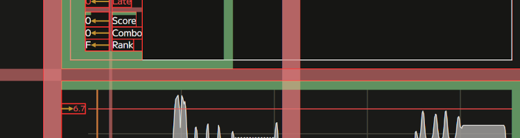
Debug overlay
Finally, to help understand what’s happening under the hood, a debug overlay can be enabled in the config:
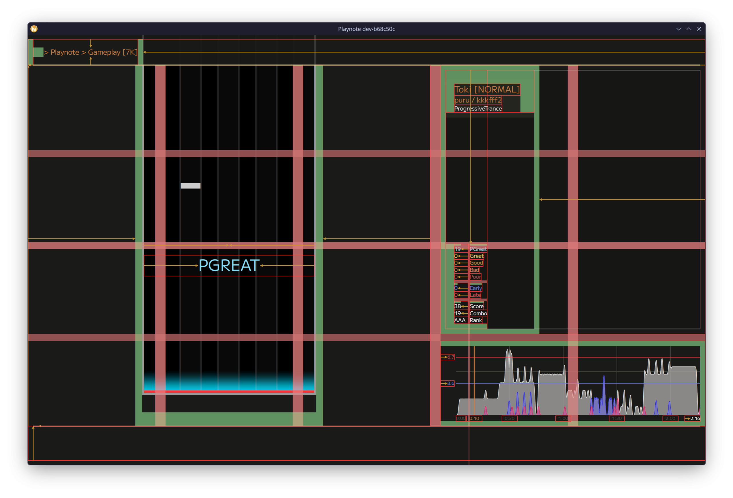
Here’s what it all means:
- Red rectangle – a widget’s border,
- Yellow arrow – alignment guides,
- Green fill – inset,
- Yellow fill (not shown here) – negative inset (extending a widget beyond available space),
- Red fill – a layout widget’s gutter area (here a 5×4 modular grid).
Whew, that’s it! Thanks for making it through all that. There’s one more thing now, before wrapping up.
Surprise announcement
To thank the early Playnote believers, the list of users in the Playnote Discord server has been snapshotted as of the time of writing this, and will be featured in the game’s credits. They are as follows (in no particular order):
- Aqo,
- Ennea,
- greenhu,
- Houli,
- krispekremy,
- Skannick_,
- stinkerdoo,
- Ars Magna,
- chozo,
- boykisser90001,
- hydrosu!,
- Koriko,
- LJKYU,
- Clem,
- Tear♪. Wait, no, that’s me.
Please let me know if you would prefer to be credited differently, or removed.
The end!
This has been an adventure! Now I can kick back and relax with the feeling of a job well done. And then get back to the code, there’s the remaining 90% of the game to be made.
I figure something should happen once the chart is over…