The Talos Principle was an incredible game, with cleverly designed puzzles and a gripping sci-fi story with mature philosophical themes, so it’s hard to overstate how excited I was about news of the sequel. Just a few days ago, Croteam suddenly dropped a PC demo of the sequel, featuring a shortened intro sequence along with two of the game’s locations. Lots of people have tried it by now, and I think by now it’s safe to say the general consensus is that the game is incredibly promising, with huge upgrades in visuals, variety and scope. A lot of people experienced graphical issues, though. I’ve got some experience with realtime graphics, so I decided to look deeper into this.
What’s the point, though? It’s easy to say that “graphics don’t matter”, and enjoy what’s there. The issue though isn’t that the game is ugly, because it’s obviously not. The problem is that TTP2 is a game of careful observation and analysis, and the visual effects used by the game constantly distract a player who’s focused and highly sensitive to small details, the boils and shifts taking attention away from genuine content, taking away from the immersion and integrity of the experience.
In the analysis below, I’ll try to explain all the terms I use in a way that makes sense to an average gamer.
Engine
Let’s begin, then. Most people probably know this, but the game is made in Unreal Engine, which came as something of a disappointment to a lot of people who were impressed by the rendering quality, reliability and performance of the Serious Engine. However, this decision was definitely not made lightly. TTP2 is a much more ambitious project than anything Croteam has made in the past, and their ideas would require huge engineering work on Serious Engine to support them. Some of the more obvious ones are:
- NPCs animated via inverse kinematics,
- Smooth facial movements synchronized with the voice acting,
- Fully dynamically lit environments,
- Asset streaming to eliminate travel loading times and reduce VRAM usage,
- Extremely optimized rendering of high object and triangle counts.

What most likely happened is that Croteam did the good ol’ cost-benefit analysis, and switching to an engine that already has the features they need to realize their vision was decided to be better. Please don’t judge them negatively for this, whether you ultimately agree with their decision or not. Making engines is an insanely time-consuming task, and without this switch we’d get TPP2 maybe 5 years later. Assuming they wouldn’t go under after this long without a release.
Global illumination
The elephant in the room. GI is the effect responsible for deciding how bright each part of the map is, and it also handles transfer of light as it bounces off walls to “color” the areas around them. Up until a few years ago, realtime GI was a pipe dream, because doing it accurately was prohibitively expensive. Instead, the brightness info was precalculated during development into a “light map“, which was then read by the game to know how lit each area was. As you might suspect, this meant that lighting conditions could not change at runtime. A change in the geometry wouldn’t update the overall lighting of the area. Even something as simple as turning a light on or off would require baking two versions of the lightmap, introducing delays in development.
So, moving GI to realtime is an extremely alluring prospect to developers. They can simply design the levels and place the lights, and everything is just lit correctly. Any part of geometry can be moved, lights can turn on/off or even move, and the lighting updates with them. It not only makes development faster, but unlocks new ideas for highly dynamic environments that weren’t possible before. That’s the idea, at least.
TPP2 went for exactly this – the GI is always dynamic, there is no “Off” option. Most likely the option couldn’t even exist, because there are no offline lightmaps to go off of. Unfortunately, the techniques used by the game are all highly approximate and exhibit a lot of artifacts. As far as I can tell, there are three GI code paths in the game:
- Low and Medium uses monochrome rays bouncing around the map to determine how hard it is for the light to reach each surface. This results in a highly noisy results, so a denoiser has to be used to smooth out the result. The denoiser used by the game is not very good, and instead of averaging the errors it results in a party of large black dots in any crevice, and even some passages wide enough to walk through.
- High and Ultra without a RT-capable GPU uses some kind of voxel grid for monochrome area light level, with screenspace sampling for color. This causes very strong light leaking, making areas change brightness depending on how you look at them. The color transfer has no concept of transparency, so light often goes to completely nonsensical places. The denoising is still low quality and exhibits constant boiling.
- High and Ultra with a RT-capable GPU is largely similar as above, but some passes use RT to be less approximate. Issues are reduced but not removed. This is the most favorable option in the game so far.
This appears to be consistent with Unreal Engine’s Lumen GI, though I wouldn’t know if it’s customized in any way. It’s particularly strange that some settings in the game have different results depending on whether RT is available. This means that two people with the exact same settings will see different results if their hardware is different enough. It would be much preferable if the RT options were separate, and greyed-out if the hardware doesn’t support them.
There is unfortunately no setting that makes the image stable and free of distracting artifacts. Some improvements could be made by customizing the denoiser and engaging RT harder when available, but ultimately Croteam just tried punching above their weight here. Their idea of a fully dynamically lit world can’t be realized well with current technology, unless you’re someone like CD Projekt RED who gets to collaborate with NVidia directly and use their state-of-the-art proprietary acceleration algorithms, and even then only the strongest gaming PCs available today could run that.
Screen-space reflections
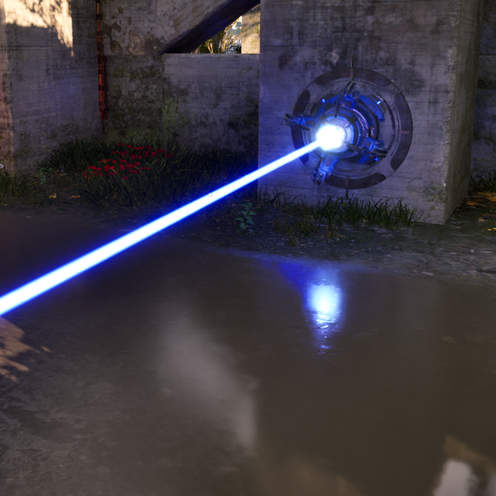
This effect doesn’t need any introduction, really. If you played any game within the last 10 years, you noticed the weird reflections that disappear if you look downwards. We all know it’s not good, but there just aren’t any good alternatives without RT, other than cubemaps which are basically just “something” remotely believable for the reflection to be with no basis in what’s actually there, and, again – they would need to be precalculated like lightmaps which is a bother during development. TPP2 has no option to engage RT for reflections, and if it did it would be really expensive. SSR is only aware of solid geometry, it doesn’t know about transparent things. It’s obvious in examples like this:

Unfortunately, the game is filled with lasers and semitransparent gates. Personally, I’d much prefer an option to disable SSR entirely and rely on cubemaps, mostly because the game’s visual design is particularly incompatible with it.

Antialiasing
AA is the longest-running unsolved problem in all of realtime graphics. The current state of the art is temporal upscaling (TAAU), which most people playing games probably heard of – mostly from the DLSS vs FSR debacle. To Croteam’s credit, they offer the entire gamut of all current TAAU implementations:
- TAAU: Unreal Engine’s old algorithm. Low quality.
- FSR: AMD’s algorithm. Medium quality, optimized for AMD GPUs.
- DLSS: NVidia’s algorithm. High quality, available only for Nvidia GPUs.
- XeSS: Intel’s algorithm. Medium quality, optimized for Intel GPUs.
- TSR: Unreal Engine’s new algorithm. Medium quality, optimized for console hardware (AMD).

Their implementation is not perfect, but good. Ghosting is weak to nonexistent, fine details don’t flicker much. Some transparency issues could be improved by providing better masks to the algorithms.
My recommendation is to use DLSS if you have an NVidia GPU, XeSS if you have an Intel GPU and TSR if you have an AMD GPU. (I found TSR to be more stable on disocclusion and less oversharpened than FSR, while also being better at preserving thin details.) Set all other settings to Ultra, and upscaling preset to Balanced. If framerate is low, lower other settings. If framerate is very high, change upscaling preset to Quality or even Native.
Verdict
TPP2 appears to be a result of extreme passion and effort, somewhat bogged down technically by an overly ambitious graphical vision, unfamiliarity with the engine and possibly a looming deadline (Who still says “2023” until two months before the year ends…?) It will never look as good as the promo screenshots in every situation you can get yourself into, but the artifacts that are there can be mitigated to some degree, and I sincerely hope this will happen for the main game’s release, or in post-release patches. Either way, I can’t wait to dive in when it releases on November 2nd.

