Text is hard! We’ve all heard so by now. The most popular diss-post on text rendering though is written through the lens of working on a web browser. A browser has to be able to display any website in the world correctly, so it has to support every edge case ever. Isn’t everything else going to be just as hard, then? Loading images or playing audio must be hard when you’re writing a browser, too. Is text really special among all these difficult problems?
It depends. Everyone has different needs, and has access to different toolkits in their environment that automate some parts of the process. You may well be satisfied with a small fraction of the text handling a browser does, or embed an entire web engine for the peace of mind. Nevertheless, text has reputation for being almost certainly more involved than you first expect.
I’ve just escaped this particular rabbit hole myself, so I’ll be writing down my experiences here. Maybe they’ll help someone, and if not, hopefully it’ll be amusing. In the morbid fascination way, like watching a trainwreck. Enjoy.
The plan
Just like with any other system, it’s best to start by establishing what you’re actually looking to make. A lot of people here will decide that they’re just doing English text and nothing else, ever. They might well be right! Unfortunately, not even that saves you from a lot of the complexity. But, more on that later.
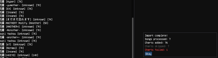
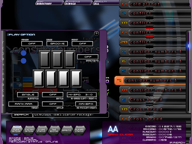
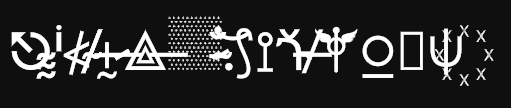
For Playnote, I need to be able to render the song titles and artist names of any BMS out there. They do like themselves some Greek characters sometimes, not to mention random symbol vomit:

The majority of them are thankfully just English, Japanese or Korean. Japanese has a lot of kanji, but it’s nothing that even SNES games couldn’t handle, so it can’t be too bad. I do want to render it all correctly, though. As for how to actually render the characters – all the rest of my graphics will be 2D SDFs, so why not text too? The msdfgen library seems perfect for this.
Alright, that sounds like everything I need to know to start conjuring up some sort of algorithm. Let’s go.
First I need a font atlas, right? Let’s generate one with all the characters I need. At runtime, the game wants to draw some text string. Iterate through that string character by character. For each character, look it up in the atlas. Enqueue it for drawing, and move the cursor to the right by the “advance” value. That’s it, we’re done!
Sounds reasonable, right? There’s just one problem – every single sentence here is wrong.
“First I need a font atlas, right?”
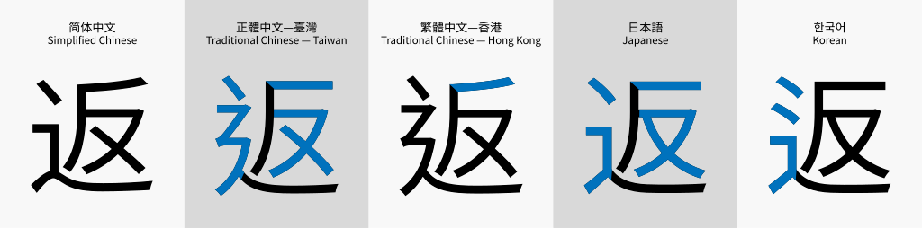
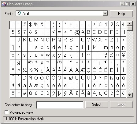
No, it turns out I need a fonts atlas. There’s only like three fonts out there that support every writing system at the same time, and they’re either boring or ugly. Even just Korean and Japanese usually need separate fonts, not to mention all these weird symbols from earlier. There’s no way around it – to cover everything I need, I have to find several fonts that look good together, and mix-and-match their character sets. Annoying. In practice, this means making sure their metrics are similar relative to each other, and then adjusting their sizes so that their em-heights are equal.
“Let’s generate one with all the characters I need.”
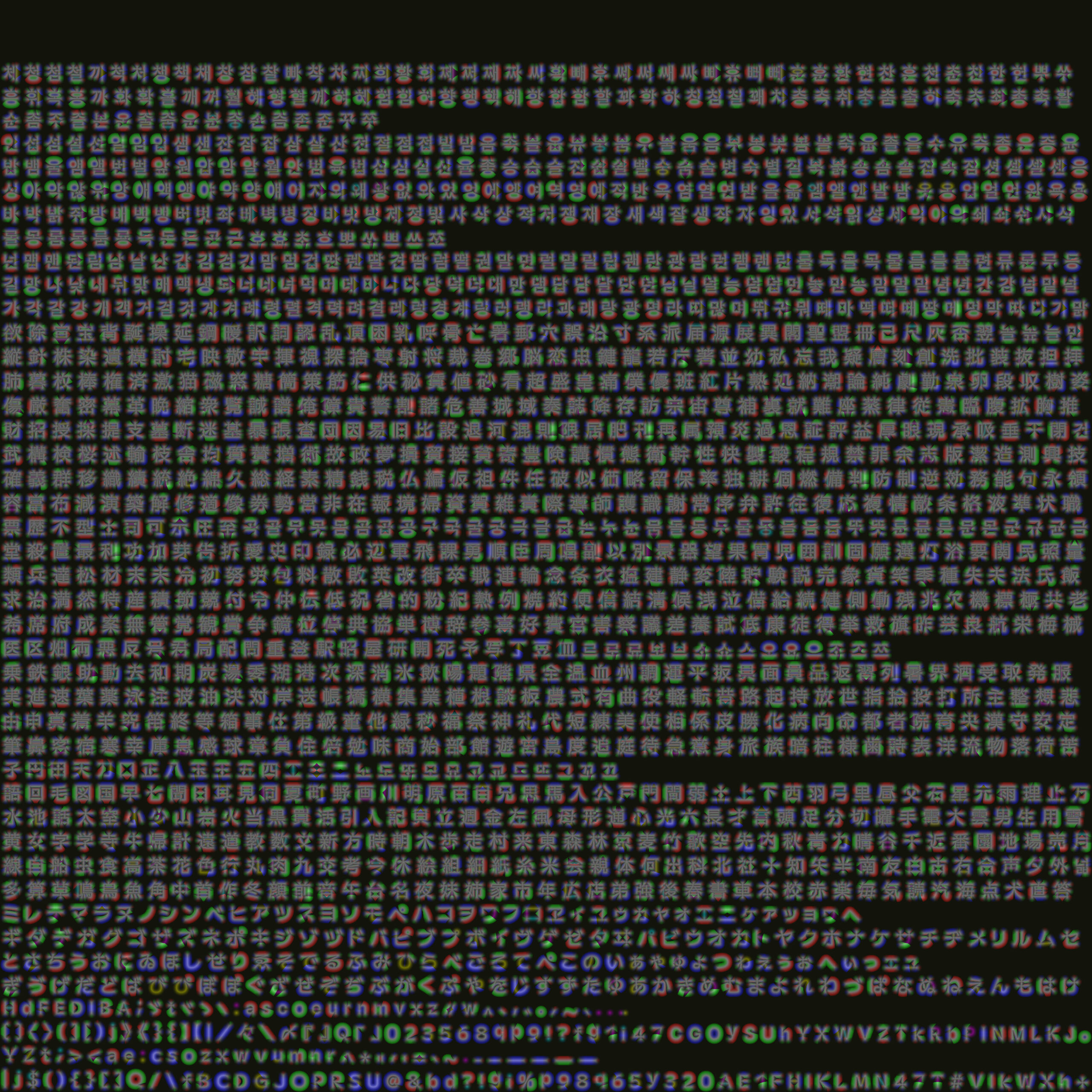
You’ve probably seen this one coming. Old games have the benefit of knowing all their text, so they can precompute a set of only the kanji they need, or even just ask the writing team to simplify some phrasing. On NES, most games didn’t use any kanji at all, instead spelling out their pronunciation, similarly to reading material aimed at children. Meanwhile, I need to be able to show anything that any BMS creator has ever written. And… there’s a lot of kanji. Over 2000, and that’s just in common modern communication. And Korean? Sure, Hangul (the Korean writing system) is composed of 48 individual characters, but fonts store entire syllables as single characters, so that they can tweak each possible combination to look good. There are over 11 thousand possible syllables, but thankfully “only” about 4000 are in common use. I wouldn’t be surprised if there’s Chinese BMS out there, too…
What’s the right thing to do here? By slimming down our character list, I risk missing something I might need, but including everything just in case would result in massive atlases full of never used characters. The solution I went with is to generate characters on demand. If some text requires a character that’s not in the atlas yet, rasterize it into the atlas, and keep it there for later use, until the game is shut down. Generating lots of characters at once could cause a noticeable hitch, so I’m actually keeping two atlases – a static one with commonly used characters comes pre-generated with the game files, and a dynamic one starts out empty and fills up as needed.
“At runtime, the game wants to draw some text string.”
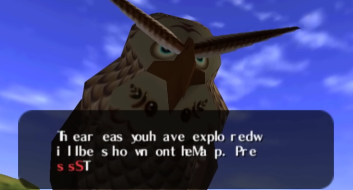
“Some text string” is doing a lot of heavy lifting here. To have any chance whatsoever at correct text rendering, the libraries involved need to know much more about it than that.
First is the matter of encoding. In a perfect world everything uses UTF-8, but BMS is far from perfect. Japanese BMS tends to use Shift JIS, while Korean uses EUC-KR. These need to be detected and converted into a single known encoding to even have a chance at drawing anything besides English text correctly.
What might come as a surprise is that knowing the language is important, too. There are cases in which the same text looks different depending on which language it’s in. The example that’s most relevant in my case is hanzi (Chinese characters) and kanji, which due to Han unification efforts map Chinese and Japanese variants of a character to the same byte sequence. Libraries that handle this do a pretty good job of autodetecting the language from text contents, but if I know the language in advance, passing it in explicitly might prevent mistakes.
“Iterate through that string character by character.”
Easier said than done! I’ve been using the word “character” throughout the post so far, but what is that, exactly? A single Unicode codepoint, also known as a scalar, seems like a pretty good candidate – it’s 32-bit wide, covering all of Unicode now and into the future. That’s not enough for this purpose, though – there’s lots of codepoints which combine with the previous one to form a single logical character. These are for example combining marks for diacritics, emoji modifiers, and all sorts of other features uses in certain writing scripts. Some of them can be eliminated via a process called “Unicode normalization“, but not others.
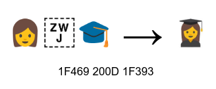
It takes something less granular, a unit that considers combined codepoints as a single object. That unit is called a grapheme cluster, and thankfully the ICU library provides iterators to process a line of text one grapheme cluster at a time. As long as grapheme clusters as treated as an unbreakable unit of writing, these composite characters will always display correctly.
“For each character, look it up in the atlas.”
Wait a second, I decided to use multiple fonts and dynamic rasterization earlier. When a character (grapheme cluster?) is already in the atlas I don’t have to care which font it came from, but if it’s missing, I need to know which font contains it. This can be achieved by querying each font in sequence until the character is found in one of them. This stack of fonts traversed from top to bottom is most often called a font cascade. It’s critical to make sure that every codepoint within a grapheme cluster is supported by the font; a partially supported one should count as unsupported, and the search for a suitable font should continue.
“Enqueue it for drawing”
I can’t put it off any longer, it’s time to address the elephant in the room. Fonts don’t contain characters. At least, they don’t contain anything we defined as a character so far – not codepoints, and not grapheme clusters. What they contain is glyphs. They are nothing more than shape definitions, with no direct typographic meaning. The query function from earlier finds a glyph corresponding to a given codepoint, but it might not be the correct way to draw that character in a flow of text; it’s only useful for existence checking, or when making something like a character map.
The magic operation that bridges the worlds of Unicode and glyphs is called shaping. It takes a Unicode string, with autodetected or explicitly provided metadata like language, and spits out a list of glyph indices. These indices only have meaning within the font that was used, and are used to retrieve the glyph itself. The number of glyphs can be smaller or larger than the number of grapheme clusters; it’s completely arbitrary. Some glyphs might be shared by multiple identical looking characters to save space and effort, and some characters can be composed of multiple glyphs.
Again, glyph indices only make sense paired with the font that contains them. My atlases can contain glyphs from multiple fonts, so when retrieving them or adding new ones, they now need to be identified by a compound key – a pair of some internal font index and glyph index. Supporting compound keys comes with some future benefits though, for example a third “weight” value would allow distinguishing between regular and bold glyphs from the same font family.
There’s one more issue to address here. Shaping returns glyph indices into a single font. I use multiple fonts though, and a single line of text might have characters from multiple fonts! This necessitates an extra step earlier in the process; the text needs to be split into runs, which are substrings that share the same font. This process is known as itemization. Each run is shaped separately, and the results glued together at the end. This is not a trivial process; for example, whitespace characters should prioritize the font used by the ongoing run rather than the first supported one, to avoid excessive splitting.
“and move the cursor to the right by the “advance” value.”
All along, I kinda assumed that each character has some sort of inherent “advance” value. Draw character at current cursor position, advance the cursor, repeat. This might be true in a simple videogame text renderer hardcoded to a bespoke bitmap font, but now that I’m in the world of glyphs and shaping, it’s a little more complex than that.
Alongside each glyph in shaping results, the library returns an xy advance and xy offset. The glyph is to be drawn at the provided offset from the current cursor position, then the cursor advanced by the other value. These are two-dimensional, so yes, they don’t have to advance just to the right. This system gives fonts more freedom to handle writing systems, as well as reuse glyphs – for example, diacritics like ä and ö can use the original a and o glyphs, as well as the same extra ¨ glyph positioned above them. This would happen regardless of whether the original grapheme cluster was in its normalized form or not.
You might ask – in that case, why does the cursor exist at all? Wouldn’t it be more convenient to get absolute positions of each glyph? Yes, it would be, but at the cost of a lot of flexibility. For example, the “gluing runs back together” step of itemization requires knowing where the previous run ended, which we know now as its final cursor position.
“That’s it, we’re done!”
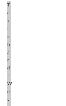
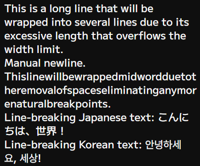
Not quite! And I don’t mean just some niceties on top of the existing design. There is one pretty important operation that has a big impact on the overall text renderer design – wrapping. No picture needed, you’re looking at a wrapped line right now!
Due to various complicated reasons, the correct way to do wrapping is:
- Shape all remaining text,
- Find the first glyph that goes over maximum width,
- Going backwards from there, find the first valid line breaking spot,
- Start a new line at this spot, and return to step 1.
The observant ones will immediately notice that this algorithm is O(n²); the more times the line wraps, the more of the initial shaping work is thrown out. Even so, this is what everyone’s doing. It’s why the best text editors in the world slow down to a crawl when lines get long enough. It’s just how it is. Okay, no, there’s one small optimization possible – since the line is itemized into runs anyway, there’s no point in shaping the next run if the current one is already past the width threshold.
The even more observant ones will realize something else is off here. Shaping brings you from the world of Unicode to the world of font glyphs. So then, how are you supposed to find a line break, and then redo the shaping from there? That requires going back from a glyph to a point in the original text. Thankfully, the shaping results contain a confusingly named cluster value, which is the byte offset of the start of the grapheme cluster to which the glyph belongs. It’s a mouthful, but it’s the perfect spot to begin scanning back, for example with another ICU iterator – you wouldn’t want your line break to split the codepoints of the same cluster apart, anyway.
What if there aren’t any convenient line break points, for example because a single word is longer than the entire available width? Nothing else to do now but break that word at the initially found grapheme cluster. Better make sure that the line always contains at least one of them, though – without guaranteed forward progress it could turn into an infinite loop.
And there you have it. After all this effort to do things right, there should now be some text on the screen. There’s just one big issue left.
It’s really slow!
This whole dance through several libraries takes its toll on the CPU. For my frame targets, I definitely don’t want to be doing all that from scratch every frame. The text renderer needs to instead offer a way to “prepare” text for drawing, returning a shaped and processed list of glyphs. Then, this list can be drawn any number of times.
What is baked into this prepared list depends on the renderer. In my case, using SDFs for glyphs, I can keep all the units size-relative, to be scaled by font size at render-time. For multi-line text, line spacing can be kept customizable as well. The whole thing needs to be regenerated though if any part of the actual text changes, including the wrapping width. If working with entire documents rather than UI elements, it would make sense here to implement a partial invalidation mechanism instead.
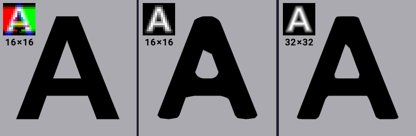
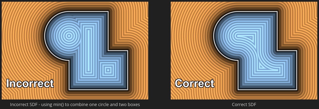
Another source of slowness is the way that msdfgen processes glyphs. In a TTF font, glyphs are made out of quadratic Bézier curves. (If you don’t know how to correctly pronounce “Bézier”, look it up – great party trick!) They’re a pretty good fit when you’re rasterizing them into a bitmap, but things get much more complicated with determining distance; fonts tend to overlap their shapes indiscriminately, but composing multiple SDFs via a union operator is not a mathematically exact operation, and causes visual artifacts if used naively. To prevent this, msdfgen uses the Skia library to reconstruct the glyphs into well-behaved, non-overlapping shapes. It’s a complex operation, and in my testing it was responsible for 80% of the entire text preparation runtime.

Fortunately, it is possible to do this just once, ever. A simple Python script can use a Skia binding to remove overlaps from every glyph in the font and repack it into a pre-optimized version. Using these optimized fonts, the runtime step can be disabled for a massive speedup. Python is not a dependency I added lightly, but it’s already available on every developer’s system, CMake is quite good at whipping up a virtualenv, and the equivalent C++ tool would take much longer to write for no practical benefit.
Results
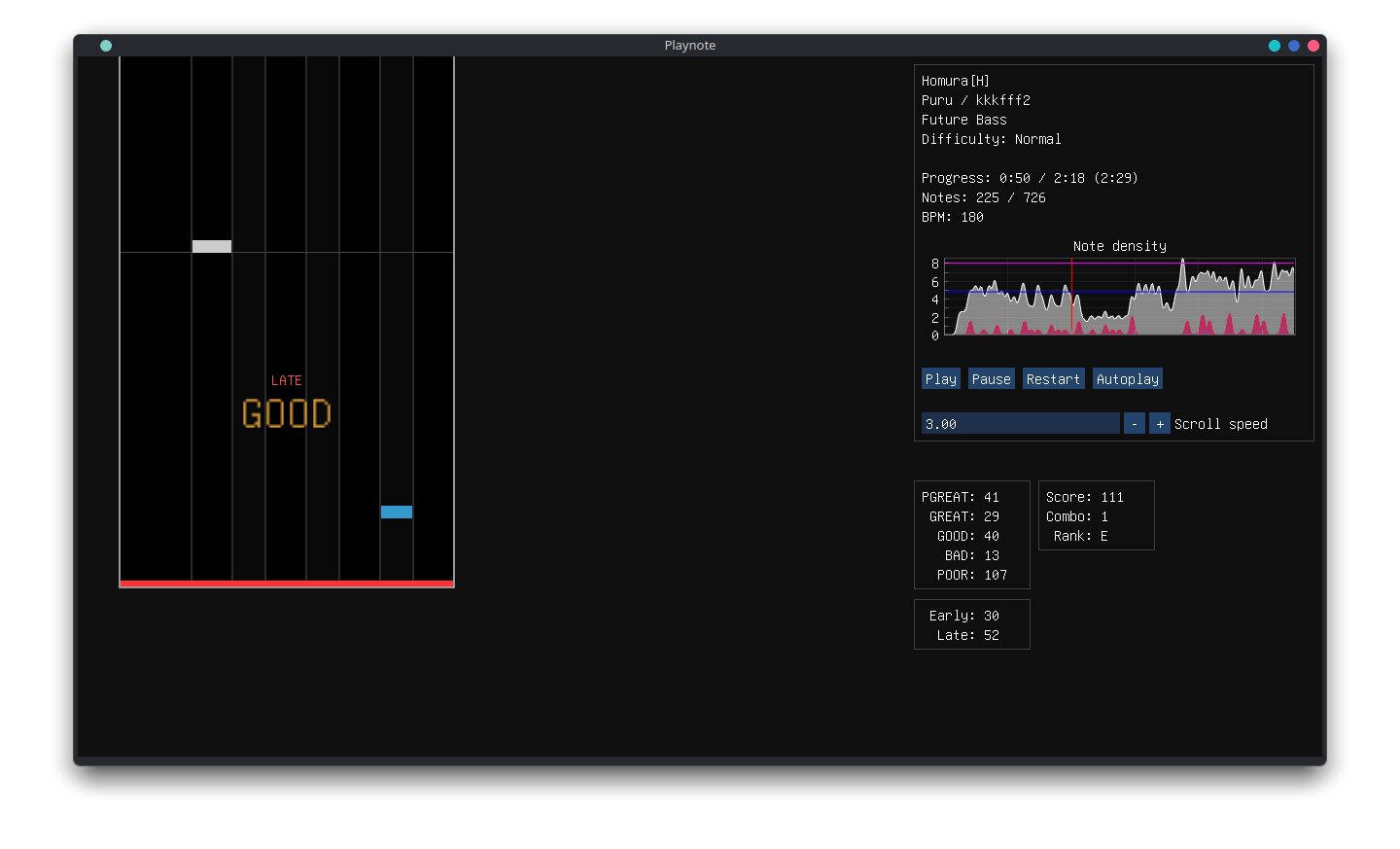
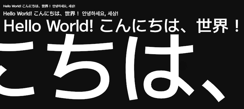
Without further ado, some pictures of the renderer in action!
⛀, a checkers piece. I’m not hunting down fonts with checkers piece glyphs.

Cool, but I’m only doing English.
This is a common reaction to this entire mess – “as long as I stay within basic Latin alphabet, everything will be simple”. Sometimes that ends up being true. Be aware of these two possible situations, though:
- Are you sure? You might not even recognize your project in a year from now. Can you definitely, 100%, guarantee that you will never support any other languages?
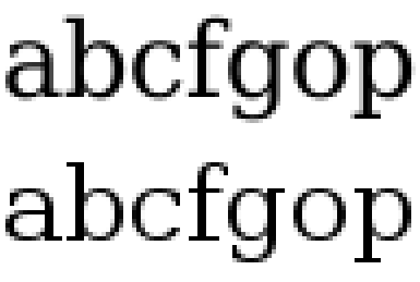
- Sometimes, English needs shaping too! Ligatures aren’t just the realm of Arabic languages, but can even form from combinations of English letters. Without shaping, the text won’t look the way the font designer intended. Shaping also makes use of more complex kerning rules (if present) in order to make text flow better – for example pushing the letters of
VAcloser together, since they fit together like puzzle pieces. You can just avoid “fancy” fonts like that, but wouldn’t it be nice to be able to import any TTF you can find and know it’ll look great without worrying about unsupported features?

What’s not handled
Believe it or not, there’s a few major complications that I intentionally decided not to support. The biggest one is RTL (right-to-left) support. The process described above makes some assumptions about text advancing generally to the right, especially in the wrapping logic. Mid-paragraph changes in text direction would have to be detected in the itemization step to be composed correctly, since HarfBuzz‘s autodetection heuristic only works for strings with uniform direction. It should never come up, since BMS isn’t popular in any countries with RTL scripts, and I really hope I’m not wrong.
The itemization step itself is currently majorly simplified from the truly correct way to do it; an enterprise-grade itemizer would split text by script, and only then split each resulting run by font. This would ensure that the shaper is always given a run alongside metadata that applies to the entire span of text.
Another possible improvement would be to output quality, with the introduction of hinting. The idea is that certain points that define glyph curves are allowed to snap to the display’s pixel grid, increasing sharpness by reducing the number of edges that the antialiasing spreads over multiple pixels. This would require rasterizing separate SDFs for every unique font size, nullifying the benefit of using SDFs. A lighter form of hinting is slight fudging of glyph positions and sizes so that their boundaries line up with the pixel grid. This is typically done in the vertical direction only, since horizontal snapping would mess up the kerning. I’m not doing that right now, but it’s a possible improvement if text ever ends up small enough for it to matter.
And finally, there is the matter of subpixel rendering – a creative abuse of the underlying RGB grid of the display to increase resolution at the cost of minor color fringing. More on that in the next post!
Conclusion
Never again. If I knew how much effort this would take, I’d have taken an off-the-shelf text renderer to begin with. If you’re thinking about it, just do that, unless you’re really big on the whole NIH thing. This was not a guide, it was a cautionary tale. Don’t repeat my mistakes. Or do, who am I to tell you that.
Addendum: Playnote News
The project now has a Discord server! It’s not really meant for general chat, but feel free to join to stay up-to-date on development progress, discuss future plans, or report an issue.
Because the server needed an icon, the project now has a logo:

P, and then something roughly in the shape of a ♩. Get it? Sorry, I’m not a graphic designer, I just write code.Addendum: The True Heroes
Throughout the post I linked and mentioned some libraries. Putting all the pieces together is no simple task, but they really do the bulk of the job. For clarity, here are all the libraries involved, and what they’re responsible for.
- FreeType: reads data from font files, like glyph curves and metrics. Also capable of rendering glyphs into bitmaps, though I don’t use that functionality.
- HarfBuzz: the shaping juggernaut. Takes a FreeType font object and a text buffer (raw bytes + explicit or autodetected metadata) and returns a list of positioned glyphs.
- ICU: massive library with tools for all things Unicode. At this point I use its charset detector, charset converter, character classification (is this whitespace?) and iterators (of codepoints, grapheme clusters and break points), but that’s just a drop in the bucket of what it can do.
- Skia: an all-purpose vector graphics renderer, factored out of Chromium codebase. Massive, massive project, used here only for its ability to rebuild sets of vector shapes without intersections, but thankfully only needed at compile-time.
- msdfgen: an alternative to FreeType‘s glyph rasterizer, taking the same glyph curves but rendering them out to a distance field bitmap instead. Optionally uses Skia at runtime to remove overlaps.
- msdf-atlas-gen: a wrapper by the author of msdfgen, for rasterizing entire lists of glyphs at a time and rectangle-packing them into an atlas, growing it as needed.